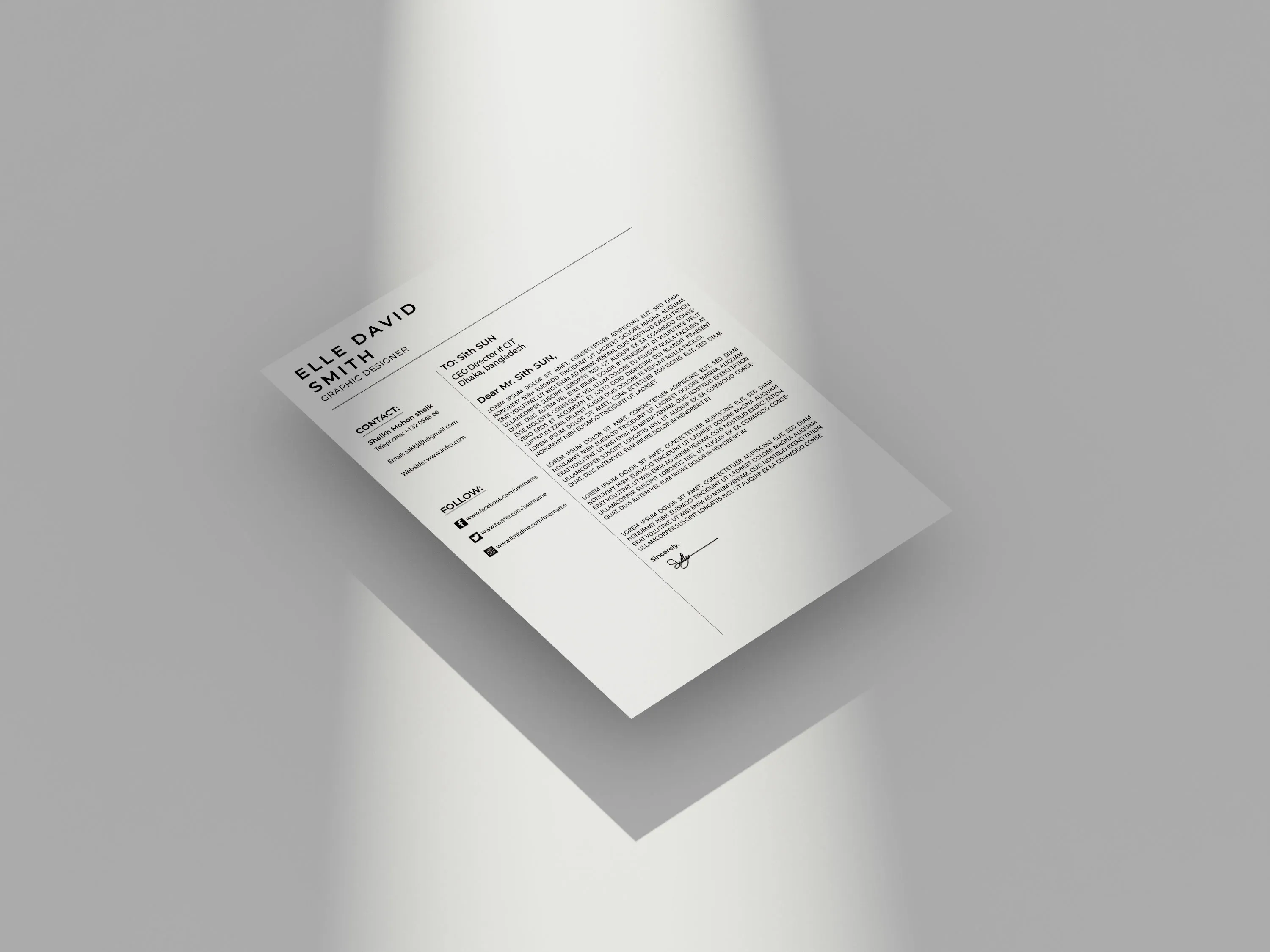
What is Cover Letter Design
Cover letter design is more than just the words you write it’s about the visual presentation of your qualifications and personality. In a world where first impressions are everything, the way your cover letter looks can be the difference between getting noticed and being overlooked. Effective cover letter design involves strategic choices about font, layout, color, and overall aesthetic to create a document that is both visually appealing and easy to read. The goal is to immediately grab the reader’s attention and encourage them to delve deeper into the content, ultimately leading to a job interview.
Why Cover Letter Design Matters
In the competitive job market, every element of your application contributes to your success. A well-designed cover letter showcases professionalism, attention to detail, and creativity, setting you apart from candidates who may have similar qualifications. Design is not just about looking good; it’s about communicating effectively. Strategic design choices guide the reader’s eye, highlighting key information and making it easy to understand your skills and experiences. A thoughtful approach to design enhances the overall impact of your cover letter, making it more memorable and persuasive.
First Impressions Count
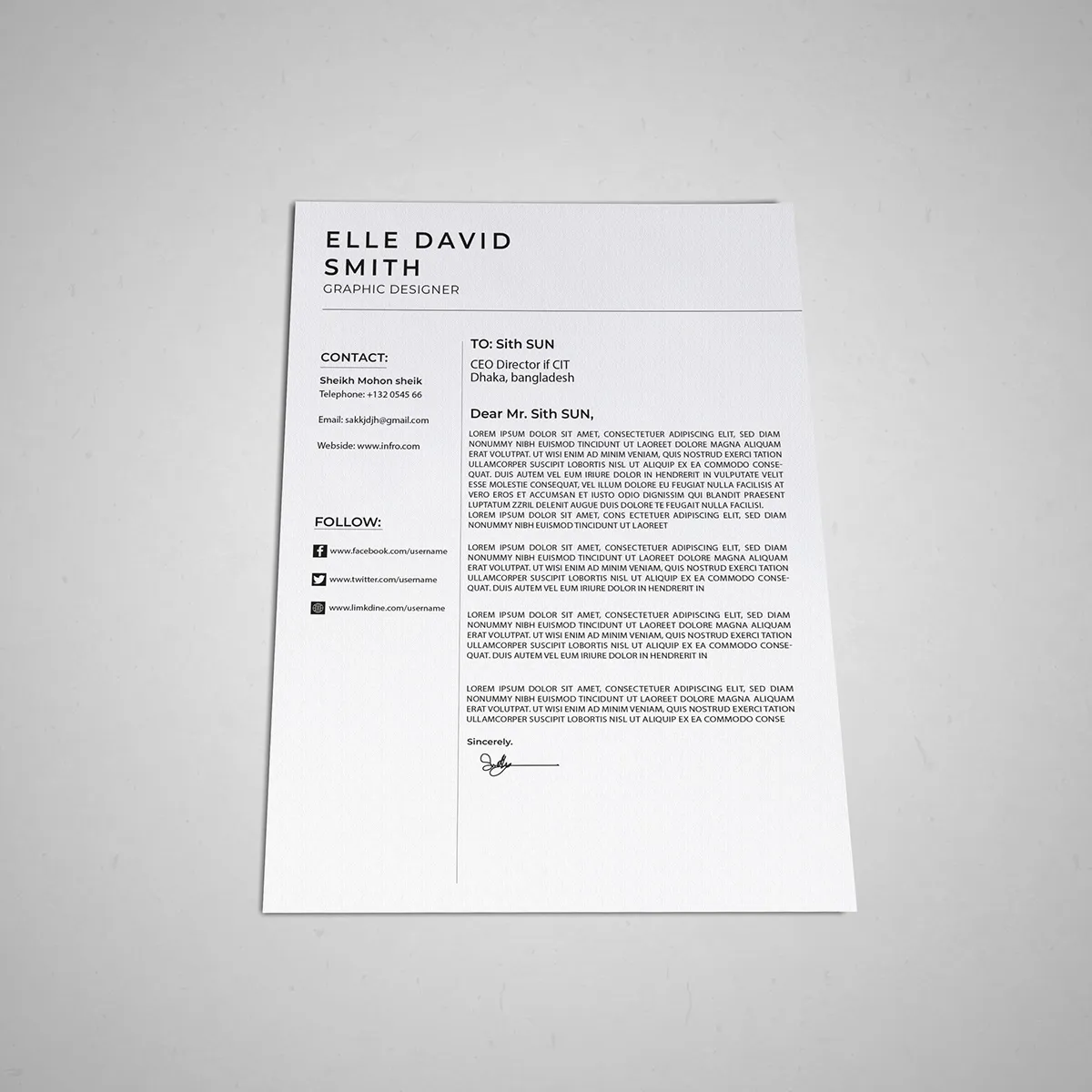
Your cover letter is often the first point of contact with a potential employer. Within seconds, a hiring manager will assess your application based on its visual appearance. A clean, well-designed cover letter signals that you take pride in your work and pay attention to detail, important qualities that employers seek. Conversely, a poorly designed cover letter can create a negative impression, suggesting that you lack professionalism or don’t value the opportunity. A great design immediately communicates your dedication to the job application process.
Showcasing Your Personality
Design allows you to express your personality and make your cover letter unique. Subtle design elements like font choices, color palettes, and layout styles can reflect your personal brand and give the hiring manager a sense of who you are beyond your qualifications. Whether you choose a modern, minimalist design or a more creative, bold approach, your design choices should align with your personal brand and the role you’re applying for. This personalization helps you connect with the reader on a deeper level and increases the likelihood of your application standing out.
Highlighting Your Skills
Design can be strategically used to emphasize your skills and accomplishments. By using visual cues, like headings, bullet points, and strategic use of white space, you can make important information easily accessible and memorable. For example, you might use a larger font size or a bold font weight for your key skills, or create a visual timeline of your experience. Effective design helps the hiring manager quickly identify your strengths and understand how you can contribute to the company, increasing the impact of your message.
Elements of Effective Cover Letter Design
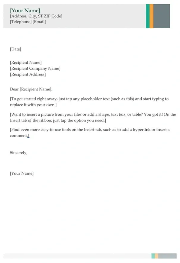
Creating a visually appealing and effective cover letter involves several key elements that work together to enhance readability and impact. Font selection, layout, and color palette are critical considerations that contribute to the overall design. Mastering these elements ensures your cover letter is not only aesthetically pleasing but also effectively communicates your qualifications and personality to the hiring manager. Paying attention to these details can significantly improve your chances of making a positive impression.
Font Selection and Readability
The right font can significantly improve the readability and professionalism of your cover letter. Choose fonts that are easy to read and complement your personal brand. Consider the target audience and the type of role you’re applying for when making your selection. The ideal font balances style and clarity, ensuring your message is conveyed effectively.
Font Types to Consider
Serif fonts like Times New Roman and Garamond are traditional and classic, conveying professionalism and reliability. Sans-serif fonts, such as Arial and Helvetica, are modern and clean, offering a sleek look. Choose a font that suits the tone of your letter and industry standards. For example, a creative role might benefit from a more unique font, while a corporate position may call for a more conservative choice.
Font Sizes for Impact
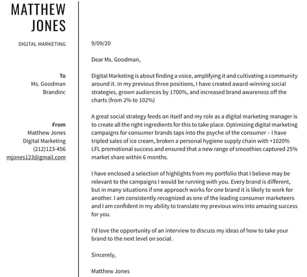
Font size plays a crucial role in readability. Use a font size between 10 and 12 points for the body of your text to ensure it’s easy to read. Use slightly larger font sizes for headings and your name at the top of the letter to draw attention. Maintain consistency throughout the document to create a cohesive look. Good font size choices help make your content accessible and visually appealing.
Layout and Formatting
The layout of your cover letter influences how easily a hiring manager can navigate and understand your information. A well-structured layout guides the reader through your qualifications and experiences efficiently. Clear formatting and consistent spacing enhance readability and make a positive impression. A thoughtful layout enhances the overall effectiveness of your letter.
Margins and White Space
Use margins of at least one inch on all sides to give your text room to breathe. Adequate white space helps prevent the document from appearing cluttered and makes it easier to read. White space can also be used strategically to separate sections, making your cover letter more organized and visually appealing. Proper margins and white space are essential for a professional look.
Visual Hierarchy
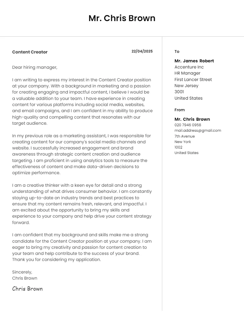
Use headings, subheadings, and bullet points to create a visual hierarchy that highlights important information. This helps the reader quickly grasp your key qualifications and experiences. Bold text, larger font sizes, and different font styles can also be used to draw attention to specific details. A clear visual hierarchy guides the reader and ensures your key messages are not missed.
Color Palette and Branding
The colors you use in your cover letter can influence the reader’s perception of your brand. Consider your personal brand and the job you’re applying for when choosing a color palette. The goal is to choose colors that are visually appealing and communicate your brand message effectively.
Color Psychology in Design
Colors evoke different emotions and associations. Blue often conveys trust and stability, while green suggests growth and balance. Red can be associated with passion and energy. Choose colors that align with the image you want to project. Be mindful of the context; what works in one industry might not work in another. Select colors that reflect your personal brand and the job’s requirements.
Branding Consistency
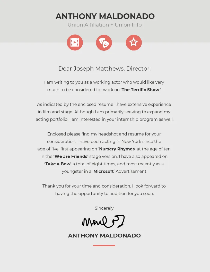
Maintain consistency in your color palette and design elements across your cover letter and resume. This helps create a unified brand and reinforces your personal identity. If you have a personal website or portfolio, ensure the design is consistent across all platforms. This consistency strengthens your brand and makes you more memorable to potential employers.
Choosing the Right Design
The design of your cover letter should be carefully chosen to match your personality, the role you’re applying for, and the industry standards. A design that is appropriate for a creative position may not be suitable for a corporate role, and vice versa. Consider these factors to ensure your cover letter effectively communicates your qualifications.
Tailoring to the Job
Customize your cover letter design for each job application. Consider the company’s brand and culture. If the company has a distinct design style, try to reflect that in your cover letter. Tailoring your design demonstrates your attention to detail and your genuine interest in the specific opportunity. Showing that you’ve put in the effort to align your design with the job requirements can significantly improve your chances of success.
Showcasing Your Portfolio
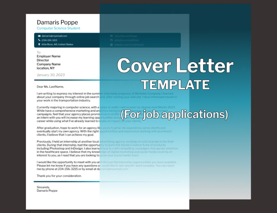
If you have a portfolio, consider incorporating design elements that reflect your style. Use your cover letter as a teaser, encouraging the hiring manager to view your portfolio for a more in-depth look at your work. This can involve a specific font choice, color palette, or even a subtle design element that is consistent with your portfolio. Providing a link to your portfolio and highlighting your design experience can showcase your skills effectively.
Design Tools and Resources
There are numerous tools and resources available to help you design your cover letter. Understanding these resources can help you create a professional and impactful document, even if you lack formal design training. These tools provide the flexibility and ease of use needed to create a high-quality cover letter.
Online Design Platforms
Several online platforms offer cover letter design templates and customization options. These platforms provide user-friendly interfaces and a wide range of design elements. Consider platforms like Canva, Adobe Spark, and Visme, which offer various templates and customization options, allowing you to create a cover letter that is both visually appealing and professional. These tools make it easy to design, even without prior experience.
Cover Letter Design Templates
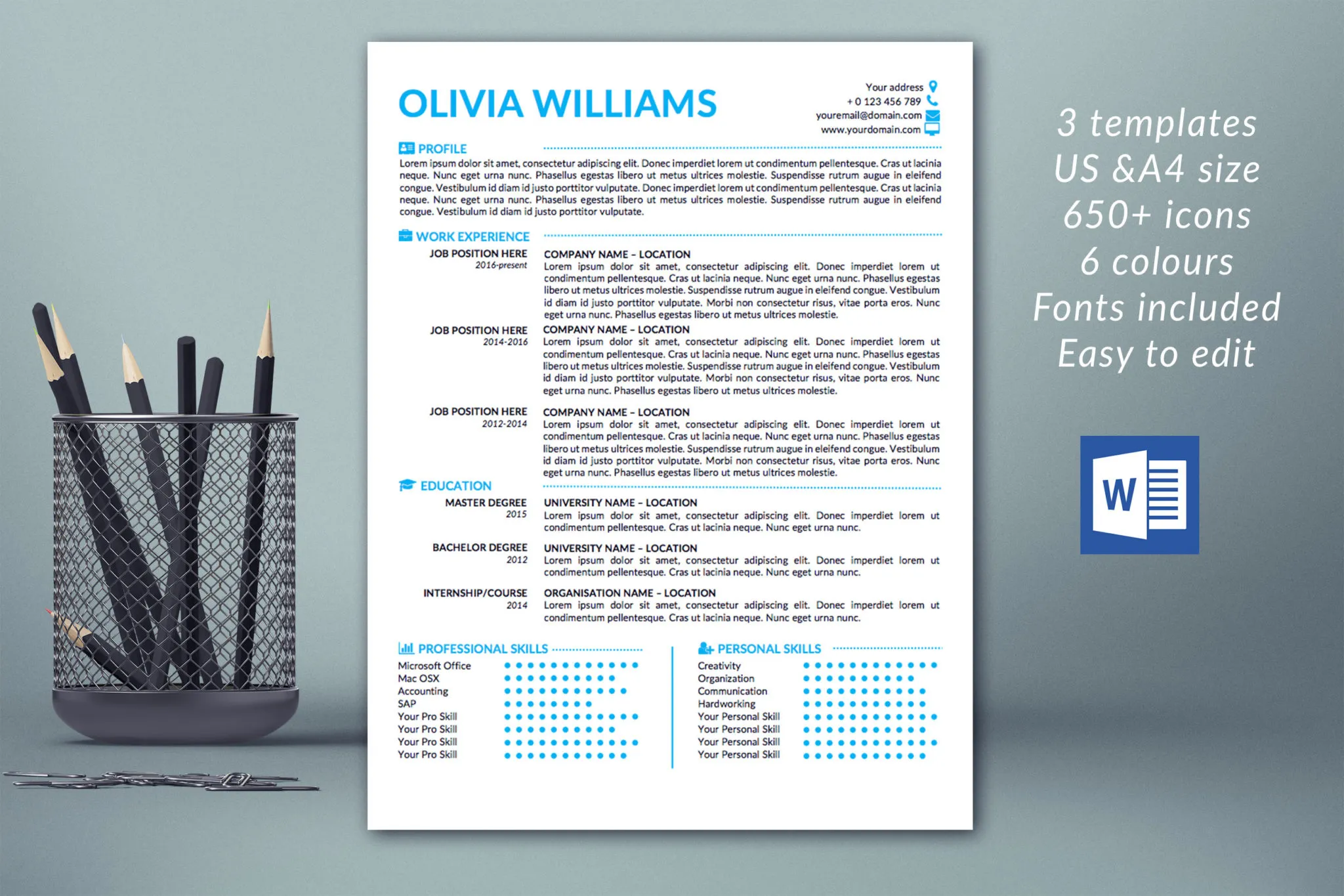
Design templates offer a starting point for your cover letter design. They can help you save time and ensure a professional look. When choosing a template, select one that aligns with your personal brand and the job requirements. Customize the template with your own information and design preferences to create a unique cover letter. Utilizing templates helps you create a polished document quickly and effectively.
Common Cover Letter Design Mistakes to Avoid
While cover letter design can significantly improve your chances of getting hired, certain mistakes can undermine your efforts. Being aware of these common pitfalls can help you create a cover letter that impresses hiring managers. Avoid these errors to ensure your application shines.
Too Much Text
Overloading your cover letter with excessive text can make it difficult to read and discourage the hiring manager. Keep your content concise and focused, highlighting the most relevant information. Break up large blocks of text with headings, bullet points, and white space. Less is often more when it comes to cover letter design. Prioritizing clarity and conciseness will improve its impact.
Poor Font Choices
Avoid using fonts that are difficult to read or inappropriate for the job application. Stick to clear and professional fonts that are easy on the eyes. Avoid using more than two or three different fonts in your cover letter. A well-chosen font will make your cover letter look more polished and professional. Prioritize readability and professionalism over unnecessary flair.
Ignoring White Space
Failing to incorporate enough white space can make your cover letter look cluttered and overwhelming. Use margins, line spacing, and paragraph breaks to create visual breathing room. Sufficient white space enhances readability and makes your cover letter more appealing. Properly using white space helps to guide the reader’s eye and highlight key information.
Conclusion
Effective cover letter design is a powerful tool for making a strong impression and standing out in a competitive job market. By paying attention to font selection, layout, color palette, and overall design, you can create a cover letter that showcases your qualifications, personality, and attention to detail. Using design tools and avoiding common mistakes will further improve your chances of success. Invest time in your cover letter design and significantly increase your likelihood of landing your dream job.
